|
| Home > Investigating
Growth of Organisms > Monarchs |
| |
|
Monarchs
|
|
|
| Change over time, growth rate |
| |
|
|
| Objective |
| |
To collect, record and graph data on larval growth. To calculate and compare growth rates during the larval stage. Overview of lessons: Students create data displays to represent change over time. Using data tables and their graphs, they calculate growth rates for larvae. They compare larva actual growth to models of constant growth.
|
|
| Lessons |
| |
- Lesson 1 .
Students are asked to create data displays to show change over time. Conventionally, line graphs are used for this purpose. Depending on their experience with graphing, students may need to explore for the first time, or review, different features of graphs, such as scale.
- Lesson 2 .
Using completed line graphs as well as data tables, students calculate growth rates for different parts of the lifespan. They determine how rate changes during the larval stages, or compare different individuals. What does the line graph show about growth rate? Is the growth rate constant? Students relate steepness of the lines on the graph to faster or slower growth, and explain this relationship. How can the rates be compared over intervals of different length?
- Lesson 3. Create a line graph from data for a larva of unknown age. This could be a larva that was collected on milkweed. Using data and graphs, can students decide a likely age or stage for the larva, even though their data are incomplete?
|
|
| Children's thinking during lesson |
| |
When students have little or no prior experience with creating line graphs, their first attempts to represent growth data fall short. The most common errors include using non-linear scales on the graph axes, representing change over time in bar graphs, and omitting clear labeling. They may also represent time on the vertical axis, which is not inaccurate, but is not conventional. If the axes are not labeled, this can be confusing for a reader who is expecting a conventional graph.
|
| |
|
|
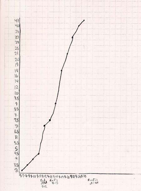
This line graph illustrates several common errors that students make in their earliest attempts to plot growth. Note that both scales shown on the graph are not linear. The vertical axis begins with a scale of .5 mm per square, continues with 2 mm per square, then changes again before reaching the maximum value. The horizontal axis is also non-linear. Another misleading feature of this graph is that the student has actually plotted two caterpillars (the first one died on 9-12 and a new caterpillar was measured on 9-13 and later). Since the line is continuous, it seems as though the graph shows one caterpillar.
|
| |
|
| |
|
| |
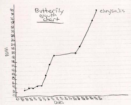
This line graph is a good example of a student's later work, or work from a student who has had previous experience with graphing. It is a more conventional line graph. The scales are linear (except for one small error on the x-axis), labeled, and the student indicates when the larva became a chrysalis.
|
|
|
| Go to the related big ideas |
|
|
|
Last Updated:
February 17, 2005
All Rights reserved
|
|
|