Correct Answers
Question 1
Access Barrier - Tiny Text

The correct answer was D, but you have no way to confirm that. The text about home inspections was way too small for you to be able to read and comprehend it. Yes, this was an extreme example of small text, but a vision or cognitive impairment can make even 8 pt. fonts feel as tiny as the home inspection text above.
However, there's no need to go overboard. A simple, sans-serif font such as Calibri or Arial at 12 pt. font is just fine, provided you use a high enough contrast between text and background. (We'll look at that next :)
Question 2
Access Barrier - Low Contrast

If you chose B, you either got lucky or have a very high-quality screen! If you happened to use the zoom function of your browser (Ctrl + or Cmd +), very clever! That's also a technique someone with low vision might use to access difficult-to-view information. The point is, though, that you shouldn't have to use zoom. If the pink text had been put in a higher contrast color (dark red, dark gray, black, etc.), you would be able to more easily access the information it contained.
People with color blindness or low vision have difficulty differentiating objects and text that have low contrast.
In the example below from Harvard University, all four of the text boxes may be easy for you to read, but the top two boxes have a contrast ratio that would make the text very difficult to read for someone with a color-related diagnosis (to the same extreme as the light pink text on a white background was for you). The bottom two boxes would be much easier to read (for all students!) because of their high contrast ratio.
Download Colour Contrast Analyzer Tool for Windows or Mac for an easy way to test foreground against background colors.

Question 3
Access Barrier - Unclear Links

The correct answer was D, and the only way to confirm that would have been to take the time to type in each URL. How much easier would it have been to identify the correct website if I had used short, informative phrases as the links instead of URLs? (see example below)
People with a cognitive disorder, motor impairment, low vision, or blindness all need clear and concise links.
In the example below, I've replaced the vague URLs with helpful link text, and the result is more usable and accessible by everyone. As tempting as it may be to share a website by just copying and pasting a web address, more people will be able to use clearly labeled links.
Question 4
Access Barrier - Heading Structure
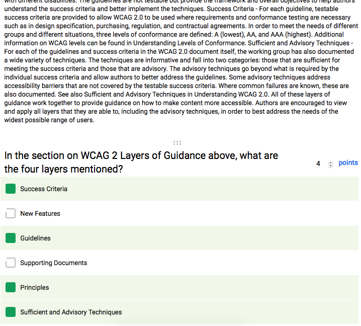
The correct answers were Principles, Guidelines, Success Criteria, and Sufficient and Advisory Techniques. Did you use Ctrl+F or Cmd+F? Cool points, if so!
I'm betting that you were overwhelmed by the presentation of the information (at least initially), and that's exactly the experience of students using assistive technologies (AT) when trying to grapple with information that's not been properly styled.
In the example below, I've added heading structure so that all students can jump straight to the WCAG Layers of Guidance section, whether visually or with AT (the AT is able to seek out the code of the Heading styles).
The important thing, though, is to not simply format text to look like a heading with Bold, Italics, etc. If you just visually format headings, students using AT will still experience your document or web page much like you experienced the text above (a rambling mess).
The image below shows a light blue ring around the Heading 3 style (red box around it) that's been applied to both the 'Background on WCAG 2' and the 'WCAG 2 Layers of Guidance' headings. This proves that the AT will be able to find the headings.
When you use the actual Heading styles in your creation software, you're adding navigational structure that aids not only students with disabilities, but it also helps all of your readers by providing them with easier navigation.
Question 5
Access Barrier - Alternative Text Missing

The question posed to the 2007 Miss Teen USA contestant states that a fifth of Americans can't locate the U.S. on a world map (answer B). Just as you could only see that there was a picture present with no helpful information, a student using AT would only hear "image" or "graphic" when no alt text is given.
Below, I've typed some alt text that could give an equitable experience of the information to someone who cannot see the image. Notice that the alt text does not simply say, "Pie chart." Alt text needs to sufficiently describe the image in a way that conveys the pertinent information in the image.
P.S. Alt text is hidden in the code of the web page or document and usually only viewable by people using AT.
Question 6
Access Barrier - No Captions
Here's the video with accurate closed captions (be sure to click the CC button at the bottom right of the video to turn them on):
The correct answer was 2.5 hours. Unfortunately, there's almost no way to understand that without sound or captioning. People who are deaf or hard of hearing need captioning in order to fully understand video content. Most of the time, a transcript just won't cut it. :-(
However! Audio clips are a different story. They DO need a text transcript to be considered accessible to all.
Another great option is "burned-in" captions at the bottom of the video frame. These "open captions" (closed captions are just fine, too) help all viewers of the video better understand the video content by representing the information in more than one way (UDL Principle #1). Captions also help people in restrictively noisy or restrictively quiet environments to understand video content. It seems difficult to lose by adding captions!
See the video below for an example of burned-in captions 👇