Design, Consistency, and Access
By Stacey M Johnson, Assistant Director for Educational Technology, Vanderbilt University Center for Teaching, and Rhett McDaniel, Director of Instructional Technology and Online Course Development, Vanderbilt University School of Nursing
Cite this guide: Johnson, S.M., & McDaniel, R. (2020). Design, Consistency, and Access. Vanderbilt University Course Development Resources. https://www.vanderbilt.edu/cdr/module1/design-consistency-and-access/
Building on previous sections, the next consideration is the collection of design choices that affect our students’ experience. When students encounter our modules, will they be able to navigate and make sense of the structures we have put in place?
As instructors putting our course content online, we make a few big choices about module design as well as a host of tiny ones, perhaps without even realizing it! Two elements to consider as we make those choices are consistency and access.
ACCESS
As we build our modules and make design choices, we’re going to try to approach that work from the perspective of Universal Design for Learning, or UDL.
Watch this short video about UDL from our colleagues at AHEAD Ireland.
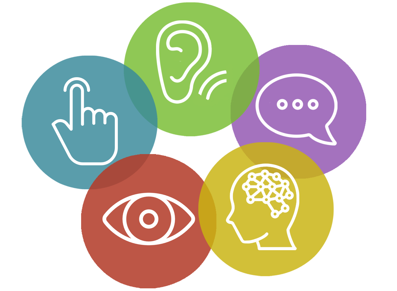
UDL is based on the idea that we should anticipate the diversity that our learners will bring to the course and plan access points that work for all learners. Thus, good course design reduces barriers to learning so ALL of our students can access our online courses. This has implications for your module design.
Consider this very reading, the one you are reading right now about designing modules, as an example.
- How many access points to this information have been provided?
- Have any users been left out?
- Can you think of other design choices we could have made to make this reading even more accessible to more users?
Providing accommodations for students with disabilities is common practice in online classrooms. However, it is possible to greatly reduce the need for accommodations in your classroom by making design choices that are more inclusive from the start.
Consider these suggestions from Vanderbilt’s Student Access Office:
- Caption videos and transcribe audio content, remembering to edit machine-created captions.
- Narrate as much visual content as feasible when creating videos or presenting via Zoom.
- Share documents as Word files to increase readability with assistive software, using accessible authoring practices.
- When creating scans of print material (books, articles, etc.), please be sure to press down on the book spine and/or close the lid of the scanner to ensure that the text is not curved in the resulting scan. Curved text is not able to be converted into machine-readable text.
These are just a few of the suggestions provided. You can find the rest as well as other useful information here.
For more information about some of the key ways Brightspace enables access online, check out this blog post with more extensive recommendations for accessible module design practices.
CONSISTENCY
Among other factors, clarity and consistency are foundational to building a course with UDL principles in mind.
This post describes consistency as having four elements:
- Naming Conventions
Are your modules and activities clearly labeled with titles that clearly explain what it is and how students should engage with it?
- Layout, Location, and Ordering
Do students always go to the same place to access the same kinds of assignments? Is it clear when things begin and when they are due? Are the modules organized systematically? Is stuff easy to find?
- Scheduling
Will students get a sense that some things are always due on Tuesdays at midnight? Live class meetings always on Wednesdays at 3pm? Will they be able to get into a learning routine? How are you creating expectations for when things happen and then living up to those expectations?
- Text, Icons, Color, Formats
Have you considered how the course looks? Are your formatting and style elements consistent and accessible to all students?
While we’re on the topic of style elements…
If you will be creating your own design elements or using lots of images in your course, it’s important to ensure that you are not using copyrighted images or graphics that belong to someone else. Many of the design elements in this site, such as the icons for modules and action steps, those elements were created by Rhett McDaniel, the CFT’s Assistant Director for Digital Media. However, even if you are not a professional graphic designer, you can create or find some very cool stuff using online tools.
Images, Copyright, and Public Domain
For public domain and creative commons licensed images, try:
- Pexels.com
- Pixabay.com
- Unsplash.com
- Library of Congress
- And the Creative Commons image search in Flickr
If you are looking for tools to create or edit your design elements, try:
In these two videos, Rhett McDaniel walks viewers through how to use Microsoft Word to create design elements and how to find copyright-free images for online courses.
The Jean & Alexander Heard Libraries have resources on copyright for Vanderbilt users here if you would like to explore that more.
For accessibility, be sure when you are uploading photos and other images to add alt-text into the description area, so that screen readers can appropriately describe what your images contain for those who cannot see them.
 |
Bookmark this Brightspace support page on accessibility so you can return to it later when you need it. |
 |
Reflect on this question: Considering the tentative module structure you sketched out in the previous section, how will you adjust or add to your module structure based on the principles in this section? |

This page is licensed under a Creative Commons Attribution-NonCommercial 4.0 International License.


