How to check the Accessibility of my content in Brightspace
When you are presenting content in your course, it’s important to think about web accessibility. Brightspace has an Accessibility Checker tool built in that will help determine if the content you’ve entered into a module is going to be accessible. This guide will show how to use the accessibility checker in a content module, however the checker tool also exists other places in Brightspace. Look for the icon anywhere you enter text in an edit box.
To learn more about web accessibility, we like this resource.
Using the Accessibility Checker in your content module
In this example, the module is already created.
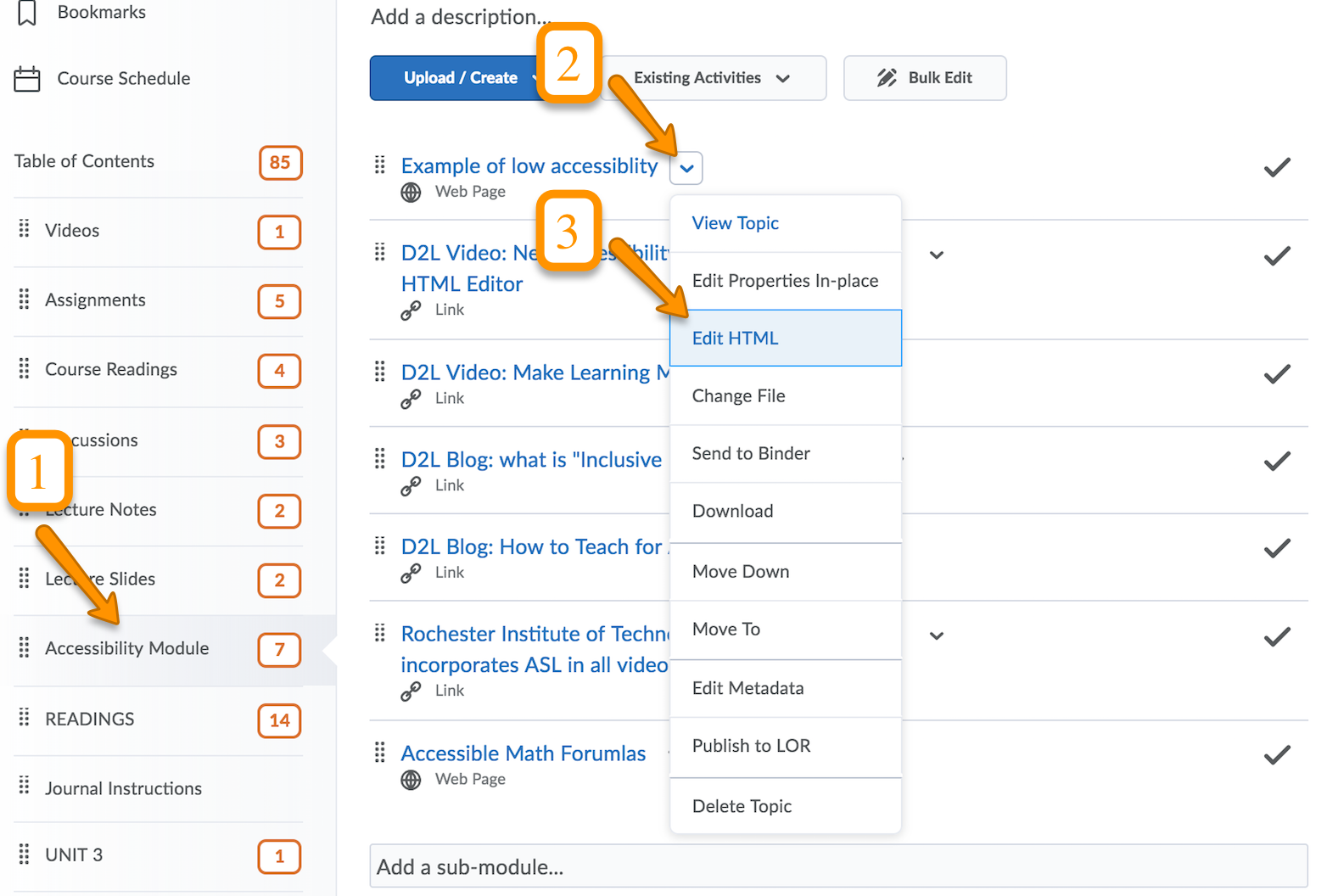
- Locate the module
- Click on the drop-down menu by the content item
- Select Edit HTML to open the edit window.

- Click on the Check Accessibility icon on the far right of the menu bar.
![]()
- The Accessibility Checker will inform you of any problems with your content. Make changes as suggested.
Examples of Accessibility Checker results
Example 1: Large text must have a contrast ratio of at least 3:1.
This issue is regarding the color of the heading text against the white background. It is too light of a color and too bright. You can experiment with color contrast ratios here.

Example 2: Text must have a contrast ratio of at least 4.5:1
Because this text is so small, it has a more strict contrast ratio. Enlarging the text will help, as well as choosing a smarter color. This is 8pt font. Fonts should be at least 12 pt.

Example 3: The selected text appears to be a list. Lists should be formatted using a list tag.
When this list was typed, the ordered (bulleted) or unordered (numbered) list tool wasn’t used. Using the list tool will present the content as a list to visually impaired students, and will allow them to easily jump from item to item with verbal commands.

To learn more about accessibility in Brightspace, or to ask specific questions, contact Brightspace Support.

